The mobile revolution has made scrolling more preferential than clicking so the one-page website trend is here to stay. Do not be fooled by the simplicity of single-page websites, because they often have all the components of a multi-page website like full-page images, description of products or services, testimonials, photo gallery, testimonials and a contact form. Thanks to web development technologies like CSS3 and AJAX, you can conveniently direct your visitors to specific sections similar to a multi-page website. We are sure that you have seen them out there and we wanted to discuss some of the things that we love and hate about one page websites.

Oftentimes, clients come to us because their previous web design firm did not work out. Here we have outlined some of the most common web design mistakes we have encountered and how to avoid or fix them. Hopefully, you can learn from them.

Whether you are a new high-tech startup starting a new website or a more mature technology mogul looking to overhaul their existing web identity, here are some website recommendations that will dramatically improve your user experience and consequently your bottom line.

Now that you have perfected a detailed and focused RFP, it is time to decide whom you want to bid on it. Shopping your RFP to every web designer or creative agency in town is counterproductive because the RFP process costs vendors a lot of research and writing time and the buyer a lot of evaluation time. Even though you are not directly paying for their responses, you will eventually as all costs are inevitably passed onto clients. To save time, money and frustration, you should do some preliminary research to find some fully qualified candidates who are within your budget instead of just mass emailing your RFP. Below are some tips on where to start your search.

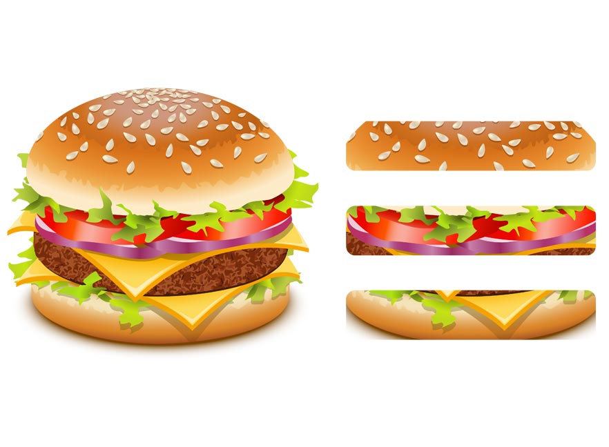
If you have a phone or tablet, you likely interact with hamburger menus on mobile-friendly websites regularly. With the exponential growth of mobile users, websites need to condense their menus into much smaller screens. As an integral part of responsive web design, the hamburger icon is a universally accepted flyout menu that minimizes website navigation into three stacked bars to improve the mobile experience.

If you have ever needed a new website, then you may have written a request for proposal once or twice, otherwise known as an RFP. An RFP minimally consists of information about the company, project requirements, and a proposed timeline. It is a lot like a dating profile in that you are not just soliciting potential web design agencies to respond to you but you are also hoping that they pick you as well. You are trying to intrigue them to learn more about what it would be like to have a relationship with you. Just like online dating, you can get a sense if the prospect is the fit or not just by reading the RFP.


